The Winter Olympics are coming to my backyard again in 2034. What would I do if I had the chance to design the logo and brand for the games?
For the last couple of weeks, in between work, school, and other responsibilities, I spent what time I could to dive into a personal passion project that would answer exactly that.
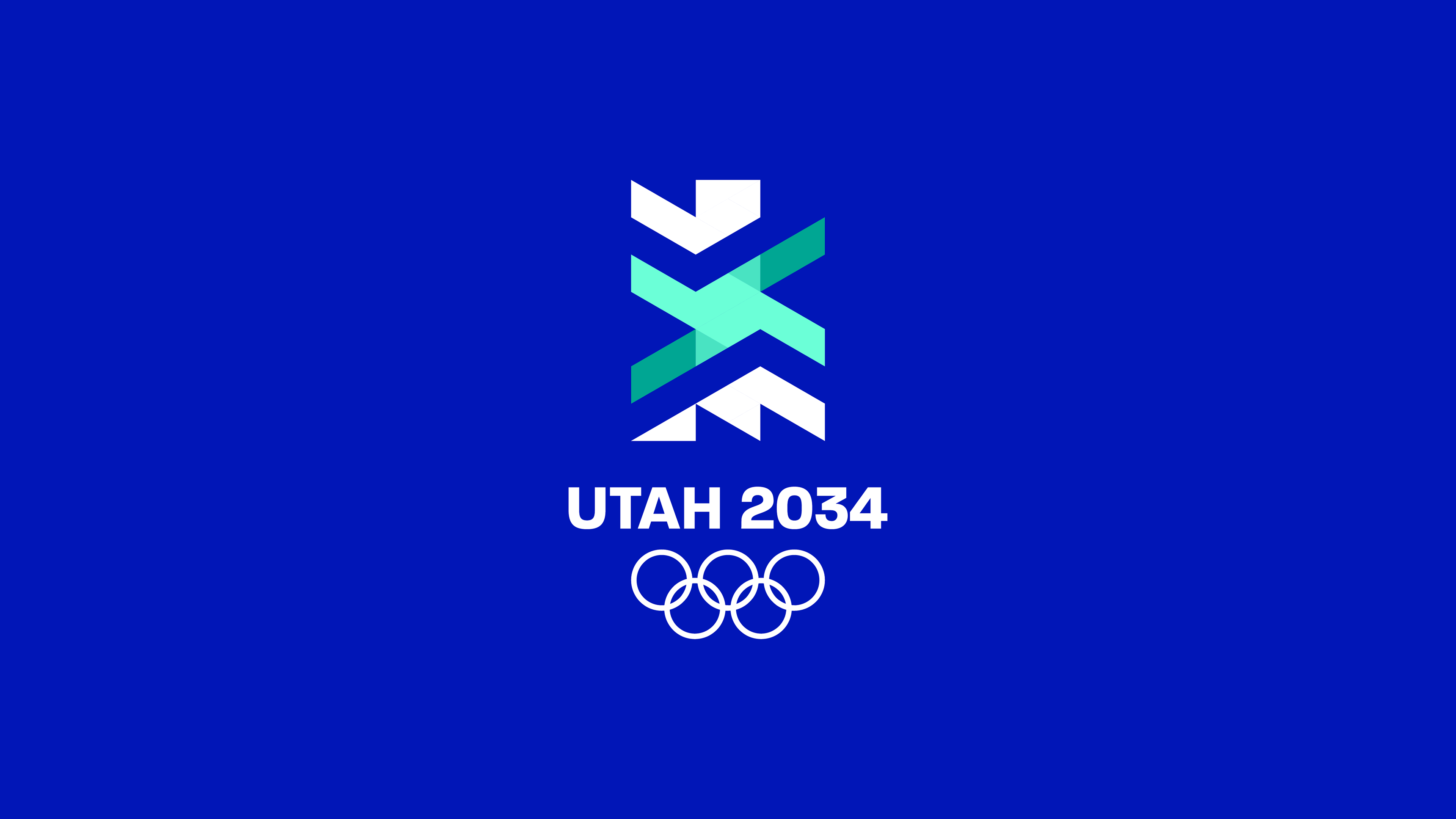
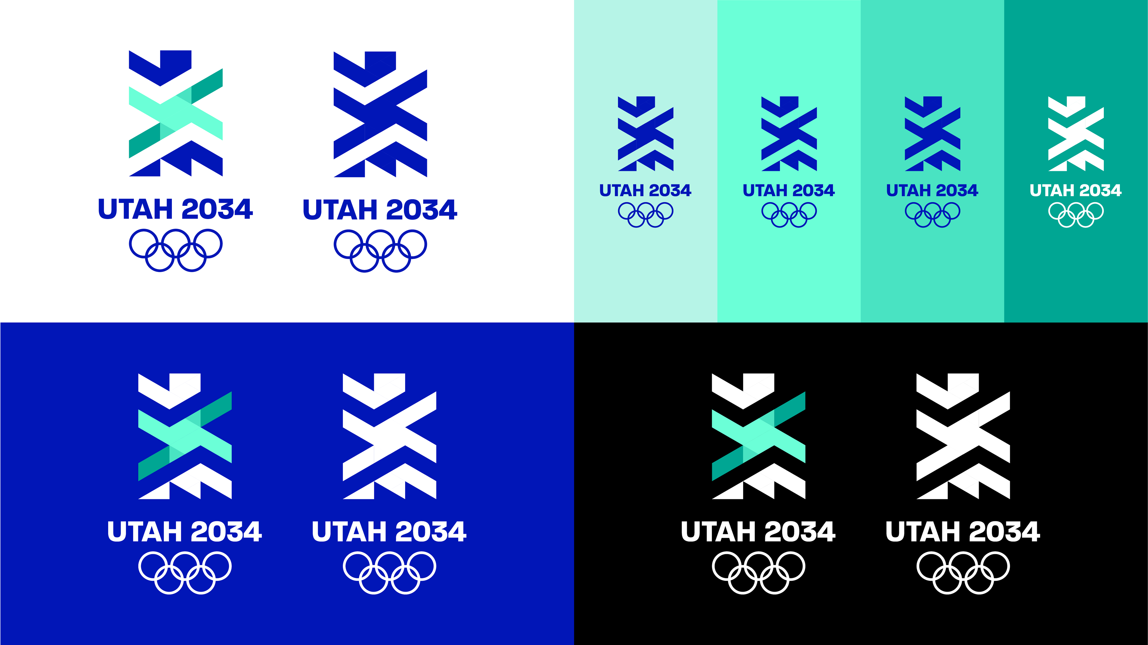
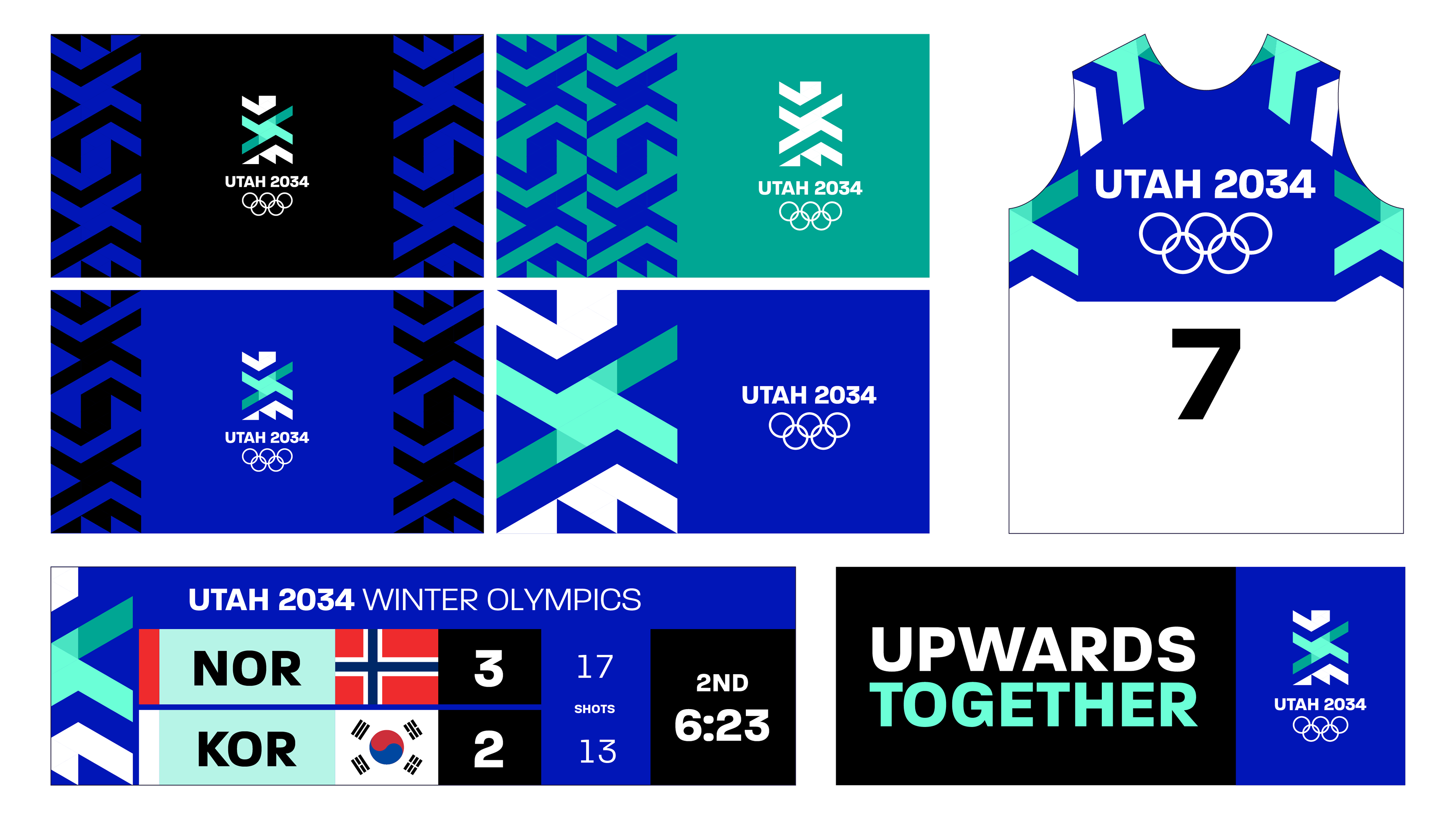
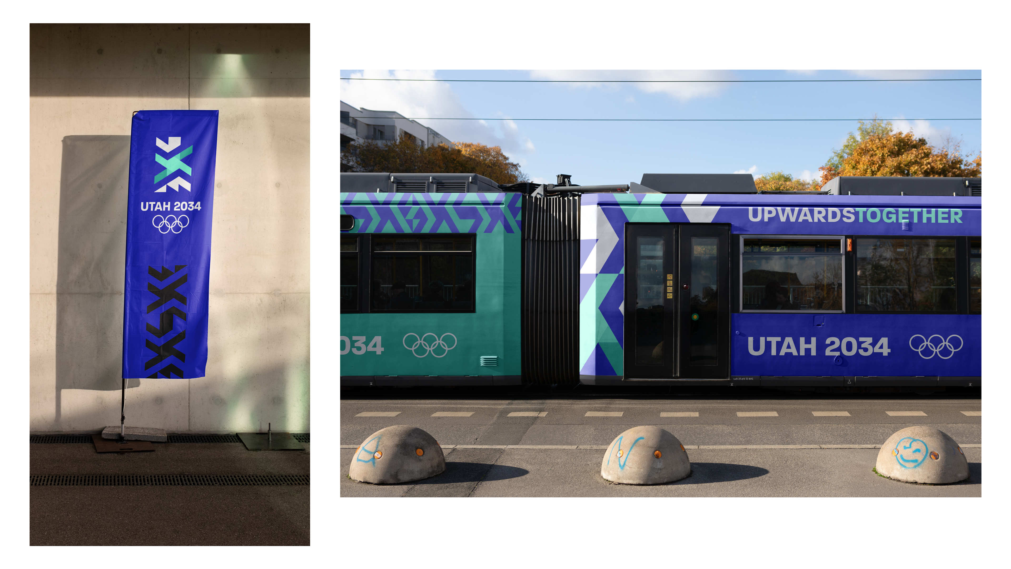
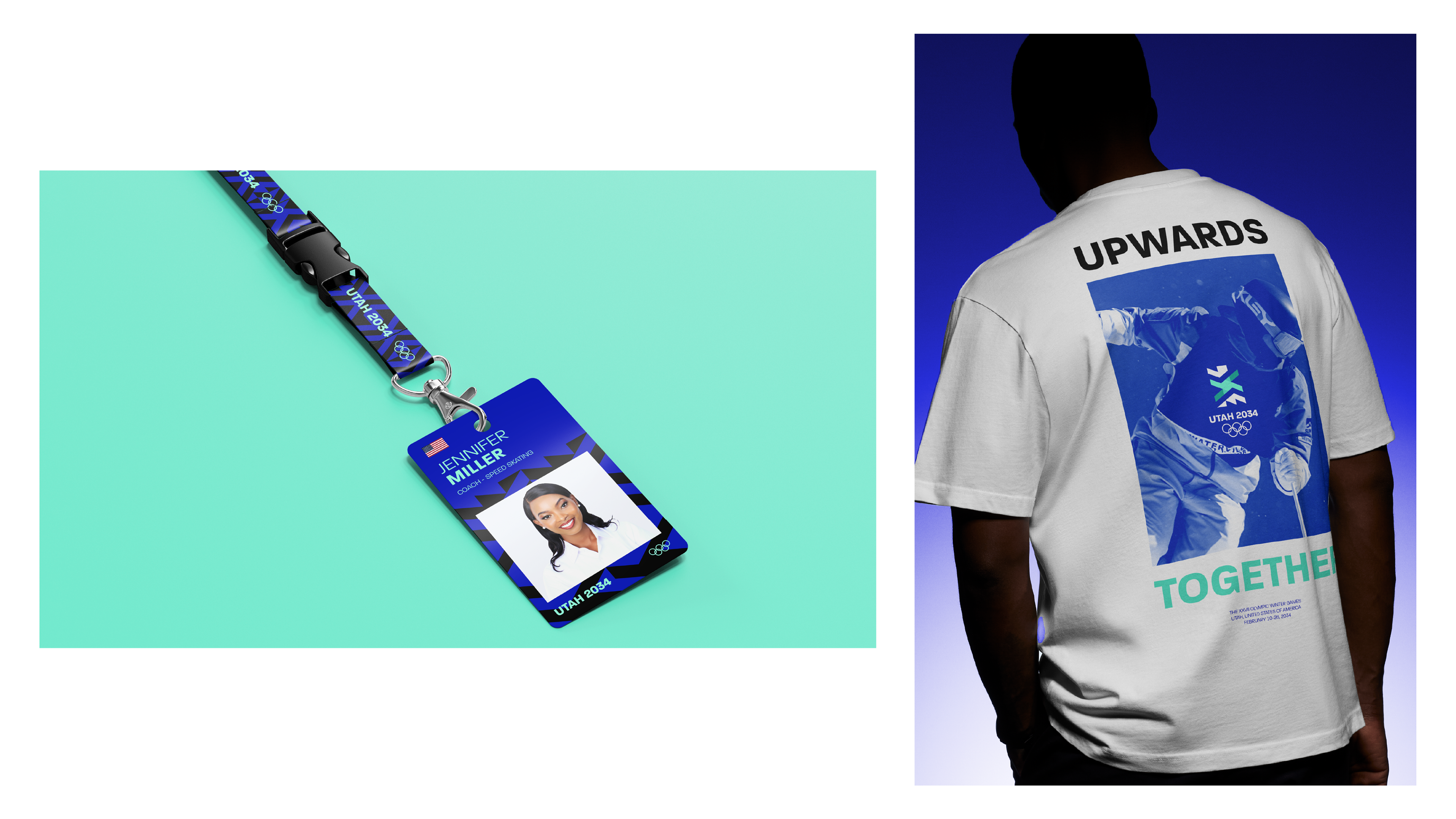
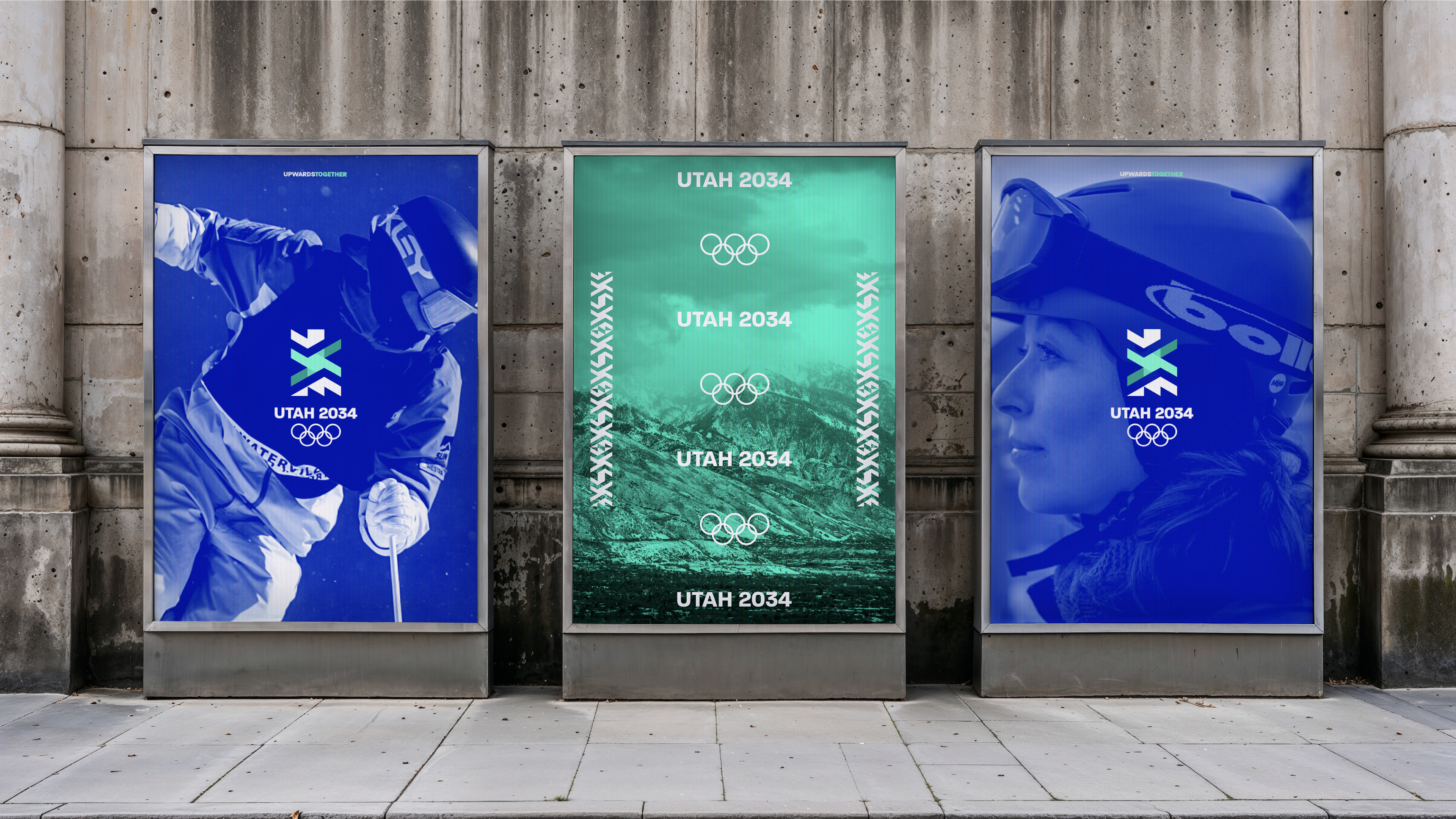
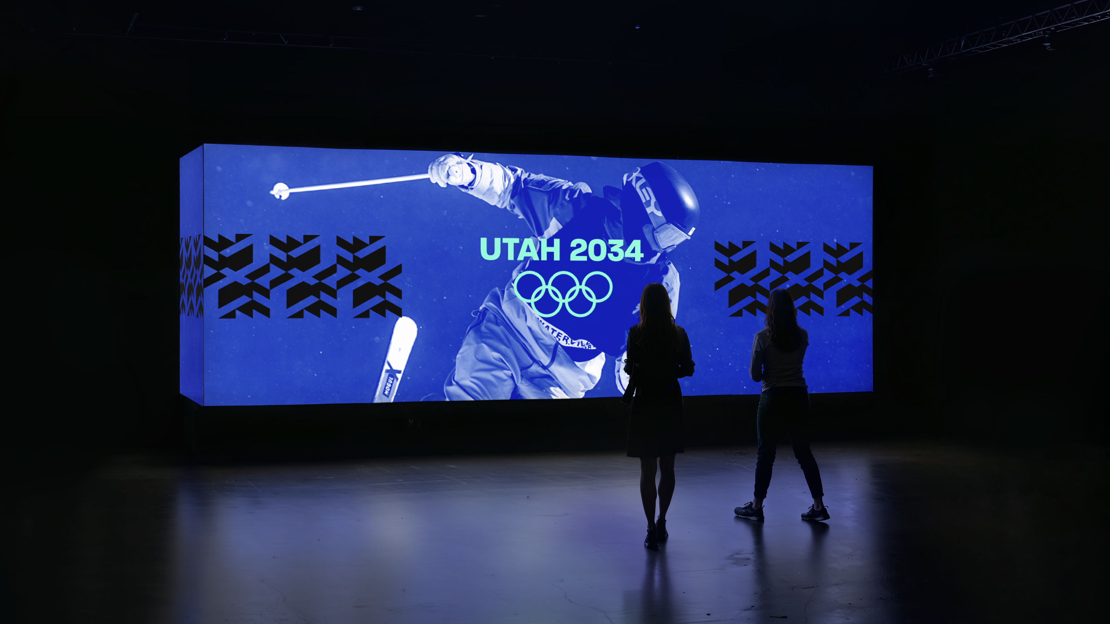
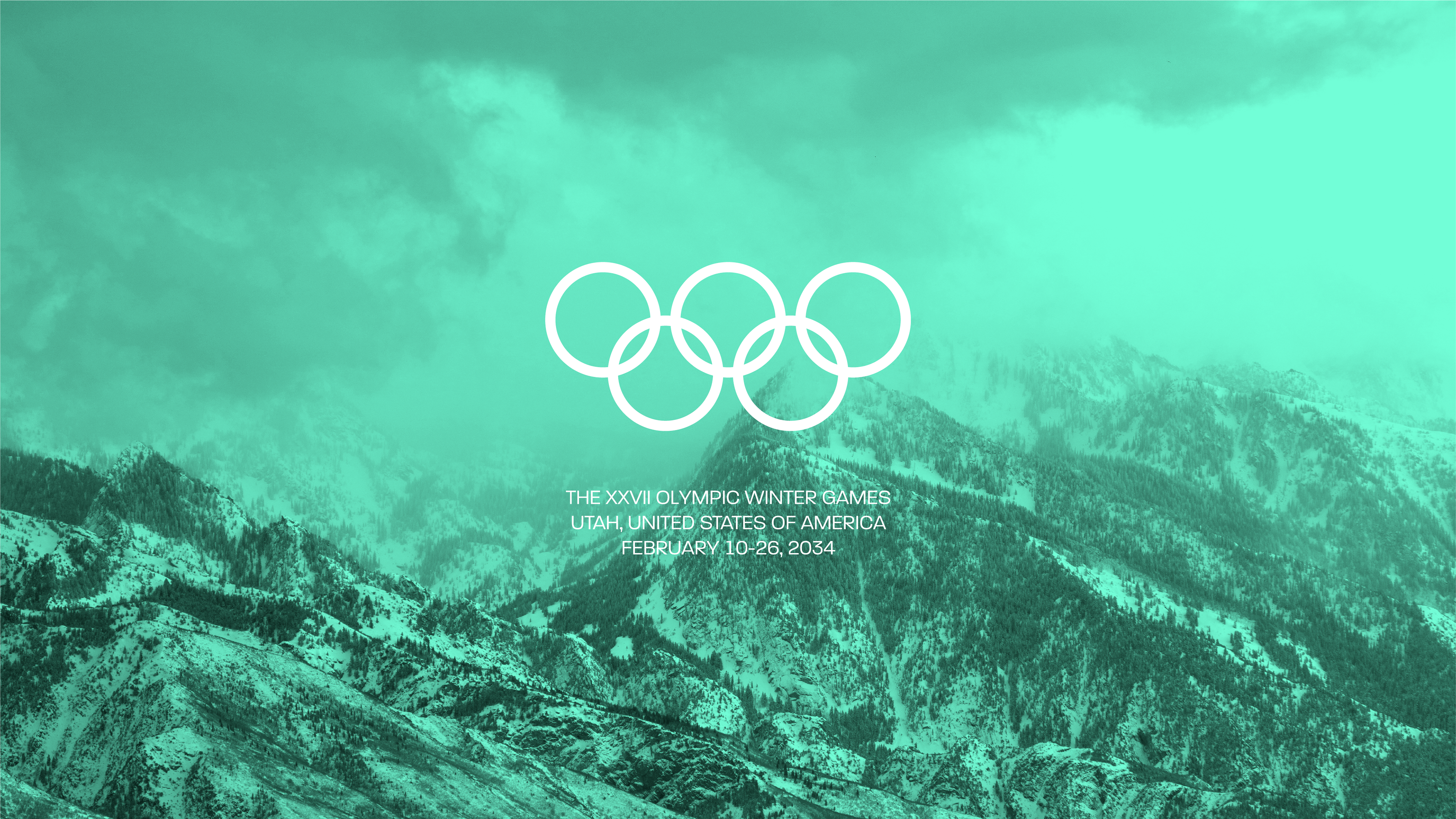
Sometimes Utah gets a bad rap as a boring, dull, uninteresting place. I wanted to respond to that perception by designing a Utah 2034 brand that represented the Utah I grew up in, know, and love. A bold shade of royal blue is paired with energetic tints of mint and turquoise, grounded in some applications with black, composing a winter-esque color scheme befitting of Utah's breathtaking scenery and bright, innovative, hopeful spirit.
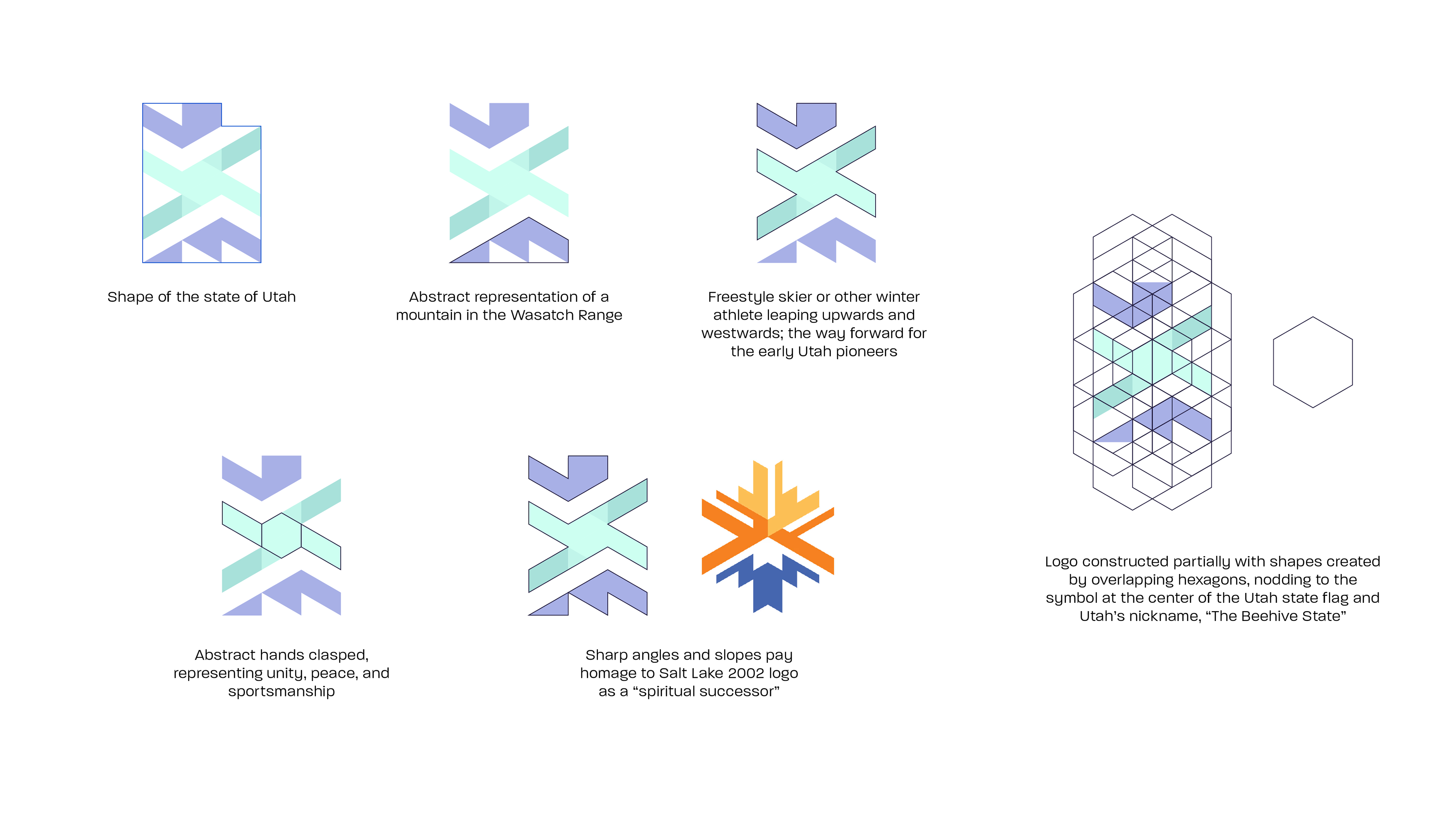
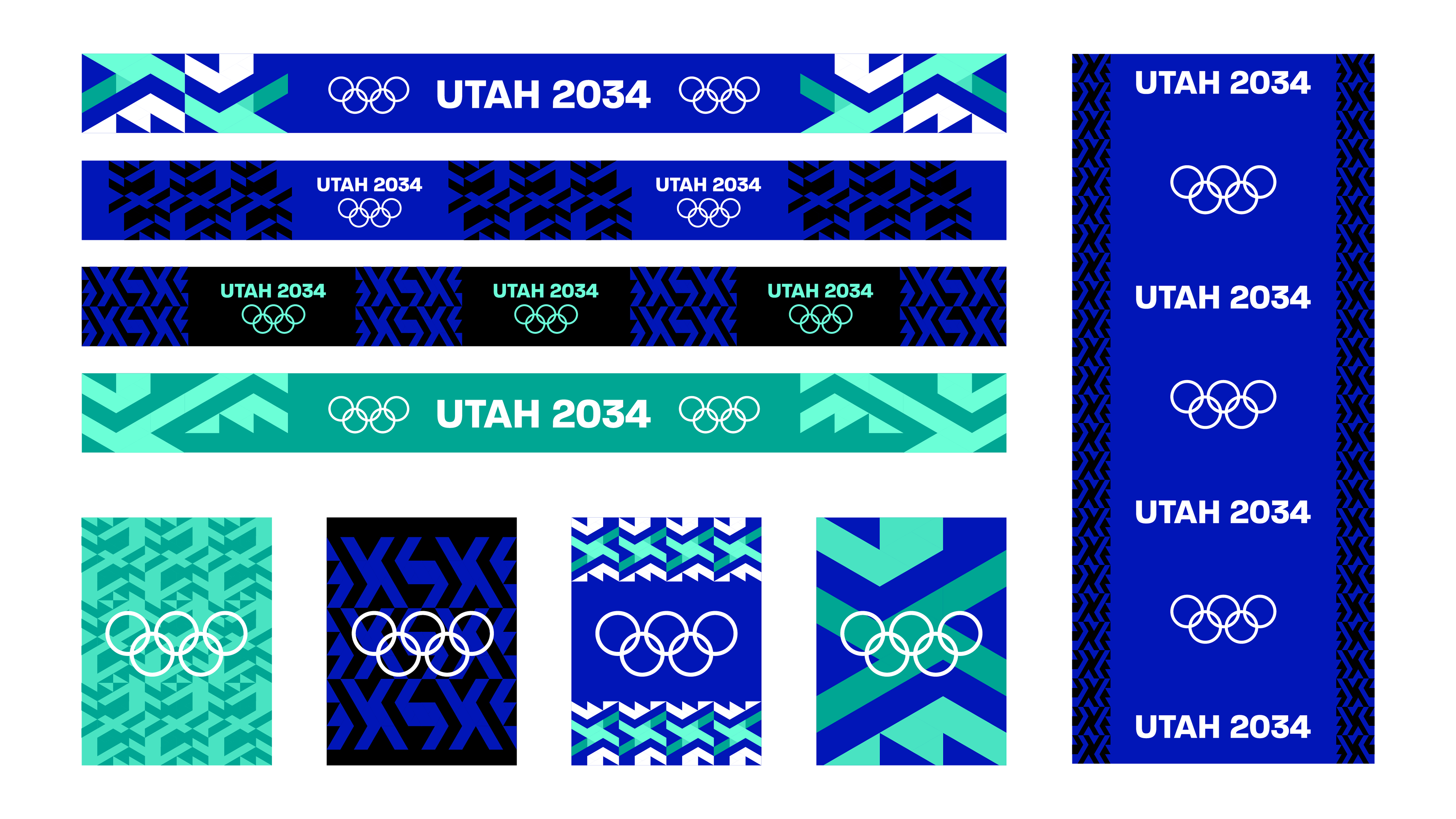
The logo is rich with both Utah and Olympic symbolism. The patterns composed of the logo's elements nod to the state's geological diversity, southwestern art and textiles, and winter sweater patterns.
The theme of "Upwards Together" contains triple meaning; the call for the Olympic athletes to gather and compete at the highest level with sportsmanship, and the call for the world to join together and aim for a higher global peace, unity, and harmony.
There is still so much that an Olympic brand covers; I couldn't possibly design every single touchpoint on my own, no matter how much I would like to! With infinite time and resources, I'd gladly do it all. In any case, I hope this is all enough to show what I would do if given the opportunity, and enough to be indicative of one Olympic fan AND proud Utahn's love letter to the games and this state.
For the last couple of weeks, in between work, school, and other responsibilities, I spent what time I could to dive into a personal passion project that would answer exactly that.
Sometimes Utah gets a bad rap as a boring, dull, uninteresting place. I wanted to respond to that perception by designing a Utah 2034 brand that represented the Utah I grew up in, know, and love. A bold shade of royal blue is paired with energetic tints of mint and turquoise, grounded in some applications with black, composing a winter-esque color scheme befitting of Utah's breathtaking scenery and bright, innovative, hopeful spirit.
The logo is rich with both Utah and Olympic symbolism. The patterns composed of the logo's elements nod to the state's geological diversity, southwestern art and textiles, and winter sweater patterns.
The theme of "Upwards Together" contains triple meaning; the call for the Olympic athletes to gather and compete at the highest level with sportsmanship, and the call for the world to join together and aim for a higher global peace, unity, and harmony.
There is still so much that an Olympic brand covers; I couldn't possibly design every single touchpoint on my own, no matter how much I would like to! With infinite time and resources, I'd gladly do it all. In any case, I hope this is all enough to show what I would do if given the opportunity, and enough to be indicative of one Olympic fan AND proud Utahn's love letter to the games and this state.